Saturday, March 8, 2014

Move It On Over!

I have changed the location of NancyBlogs to my recently reconfigured website, Nancydraws.com where my portfolio and blog are integrated into one website.

Thank you for following me and reading my posts here on Blogger. I will keep this account available with my past posts viewable, but all of my new posts will be at Nancydraws.com, which is a Wordpress site. 

I hope you will begin following me and leaving comments there.


Tuesday, December 3, 2013

Home for the holidays

Over the Thanksgiving holiday, the guest room that I slept in at my parents' house had several artworks that I created while I was growing up. Our family has moved many times over the years and it is interesting how looking at these images stirs up memories from the times that I was working on them. It's good to know that my skills have improved since, but I feel confident enough to share these, and a little bit about them....


I don't think you can consider any teenage artist's portfolio complete unless they include at least one pointilized piece. This portrait of Billy Joel, whose music I was obsessed with, was a very long-term project for my junior year of high school in West Milford, New Jersey. I remember carrying this (18" x 24"?) rolled sheet of Bristol board along with my Rapidograph pens in various sizes around for weeks... months... so that I could work on it in any spare time that I had. My fellow students were doing the same. What I want to ask our art teacher, Cormac, is Why did it have to be so hugeif we were creating it out of several million tiny dots of ink?! I am glad I chose a subject that I was already obsessed  with, otherwise I'm not sure I would have hadthe motivation to complete it.


By earning a D in Trigonometry in the first half of my senior year I convincedeveryone that I didn't deserve to be in math class any more. For the remaining semesters of that year I used a class period to work on two acrylic paintings of a goldfish, basedon a magazine photo for reference. This one is the smaller of the two, the other is much larger and displays the entire fish floating in emerald green water. There was anart class going on in  the room where I was painting and I became known around school as "The Girl Who Is Painting a Giant Goldfish!"


We're jumping further back in time with this one, I believe it is my first acrylic painting from when I was about 7 years old! My parents signed me up for an art workshop at some kind of community culture center in Corning, New York, close to the town where we lived; Painted Post. I definitely remember painting this and a little bit about how the teacher inspired this work. She had a large vase of dried flowers in the center of the table, and all of the flowers were brown or other dull colors. The class was instructed to use our imaginations as far as the color and make them look better than they did in real life.


  I like seeing this illustration next to the image above because the colors are so similar! I was inspired to create these colorful lizards after a trip to the Metropolitan Museum in  New York during my junior year of college at Syracuse University. I remember being amazed by the inside of a canoe from New Guinea that was decorated with patterned lizards at the museum and it led me to create this.


I hope you enjoyed this little artistic trip down memory lane with me. Maybe when you are visiting relatives or friends during the holidays you'll notice art or artifacts of your own that will bring up memories, too.

Tuesday, October 22, 2013

Oh, Great Pumpkin, where are you?

It is almost Halloween, my favorite holiday, and I was initially inspired to blog about my disappointment in the way that certain neighbors are improperly using spiderweb decorations around my neighborhood in Park Slope. I took a walk around this week to observe and shoot photos. I'm here to offer constructive criticism as well as kudos for what I discovered.

So, let's start off with those spiderwebs. Most people seem to think that the synthetic spiderweb is the easiest way to create that "Halloweeny look" to the outside of their homes. When applied correctly, this is very true, as long as you don't mind some stray leaves stuck in them. The problem is that most people don't know how to use them. Since I'm really into Halloween I learned how to work with this stuff when I began helping my mom decorate our home when I was in middle school, so by now I know what I'm doing.

Above is a good example of "You Don't Have to Use the Whole Bag." Just because you buy a bag of "spiderwebs" for $3.99 at CVS doesn't mean the entire contents has to end up on your stoop. Less is more and you can save what is leftover for next year, what a bargain!

This is an appropriate use of spiderwebs; nice, very "Grey Gardens." They are  stretched out across a large area and partially obscure the plants and gate.

Here's another great one! I'm not usually a fan of the brightly colored spiderwebs but I like the effect they have created by mixing it with the classic white. The proportionally sized spider lurking in its web is an excellent touch. Very spooky!

OK... if you don't have the kind of architecture that the synthetic webs will adhere to, like smooth, rounded railings, then you really shouldn't force it. The use of painter's tape to secure the webs subtracts from the creepy effects that they can potentially create. How about a couple of nice pumpkins instead? I've also seen some fun "candy corn" fairy lights that could work well here.

Sadly, the Halloween cotton candy machine has exploded, no sweet treats for the kiddies at this house! But seriously, I think some people don't understand the concept of how the webs are supposed to work... or they just can't commit the time to install them properly. It does take patience! Again, Halloween garlands or some gourds may be a better choice if this is your situation.

Let's end the spiderwebs chapter on a high note! Thanks to Dayna Bealy for sharing this picture with me. This is probably the best use of the webs I've seen this year. Compared to the first example, they are really stretching their webs for a realistic and creepy effect. I like how they surround visitors to this building, changing the experience of entering and exiting.

Now we can move on to more general decorations. I wanted to clear the spiderwebs, so to speak, before posting the rest of my findings, which are pretty great!

Who doesn't love the traditional Halloween Jack-o-Lantern? This trio will be a welcoming sight for the Trick-or-Treaters next week.

Here's a scary Halloween surprise! This rabid bat was hanging on its own from a long string tied to a tree in front of a decorated home.

I love how the Zombie Death Gnome contrasts with the "Welcome Fall" sign and the happier, frolicking gnomes around him.

Did Martha Stewart move to Park Slope?! This classy and spooky set up screams "Martha!" to me, who is a fellow Halloweenagin. I especially admire the use of the crows. High marks!

I like this, simple yet spooky. You don't need much to enhance an already scary entryway. Bonus points for the real, live guard dog inside the door on the lower right. I am sorry that it is so hard to see the pup, it was a very dark hallway.


Here are my neighbor's decorations, they always do a great job with making a 3-story spiderweb out of ropes, plus a cocooned "body," gargoyles, big spider, and more. I love it!

Finally, here's what I've done this year. Beneath the eyes are pumpkin lights which look great at night, but I can't get a clear picture when it's dark. I cut the teeth out of an old foam camping mat, attached them to some twine with wire and secured the strand inside my windows. Et voilá, a scary monster face! It isn't very visible, but I also have a large spider cut-out in the far left window.

So Happy Halloween, everyone, and let me know if you see any great decorations I should check out or if you need help hanging some spiderwebs!


Tuesday, October 1, 2013

What being an artist means to me


A shared post from Pikaland: What does being an artist mean to you?

The organizer/instructor of the online class that I'm taking, Amy Ng, is very active on her blog, Pikaland, which is how I found out about the class in the first place. This week she asks readers, "What does being an artist mean to you?" and I thought I'd share my thoughts on the question here, but make sure you also read her post at the link above.

In the Pikaland post, Amy included a quote from Edgar Degas:

Art is not what you see, but what you make others see.” ~ Edgar Degas  

Degas truly sums up my feelings about being an artist. My thought process and visual interpretation of the world are a big part of my creativity. Without the ideas or quirky observations about life my drawings, photos, and collages would not have much meaning to myself or to others, they'd just fall flat. I know that my way of thinking and observing has effected my daily life in the way that I witness particular moments happening around me and then I'm able craft them into a visual treats to share.


Monday, September 23, 2013

The Artist on The Artist

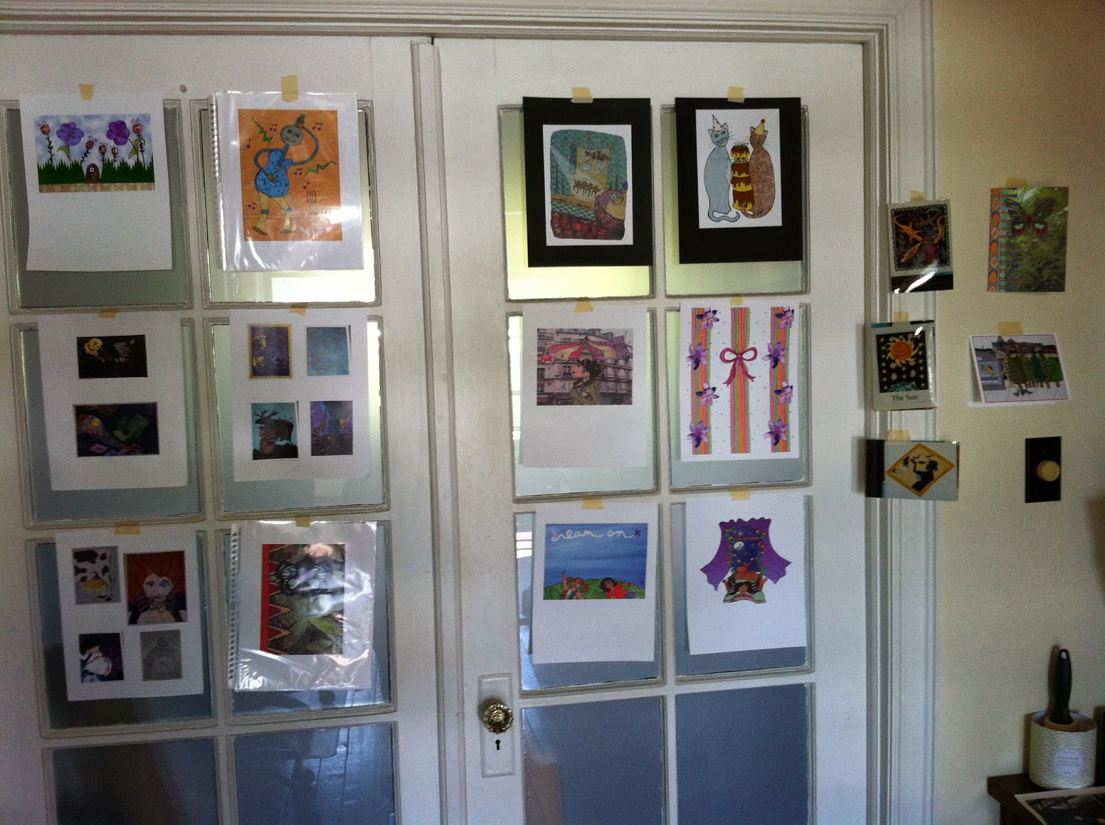
A small selection of my illustrations from over the years...

... and more on this wall. I also looked at my online work.


Recently I began an online class called Work / Art / Play via an illustration blog I'm a fan of, Pikaland. Discussing my work for the class is right in line with the main subject of my blog, finding inspiration and my artistic process. The first assignment was to look at several examples of my work from over the years and try to find common patterns and then the elements of my art that are the strongest.

So far I've noticed that I mainly use graphic, flat shapes to compose my illustrations; my work often depicts daily life mixed with subtle humor; I like to incorporate words and multimedia (collage, photography, embroidery, watercolor, pencil, and ink).

Another step was see if there are similarities between our work and the artists we admire. I was surprised to find that all of the aspects I mentioned above are present in some way for my list of favorite artists! Roz Chast, HenrĂ­ Matisse, Hanoch Piven, Romare Bearden, Maira Kalman, Alexander Calder, and Claes Oldenberg. (To name a few.)

Parts 2 & 3 of last week's module were more challenging. Since I only had about a day to evaluate my work and write out my thoughts and analysis, I know I will need some more time to consider these answers. Part 2 was about considering what matters in our lives, not just our artwork, and what we are good at in addition to our creativity. And Part 3 is about bringing the observations from Parts 1 & 2 together to figure out how to create the strongest and most self-satisfying artwork based on these discoveries.

I think blogging about it helps the process! The first week was a very interesting start to what I feel will be a valuable experience. Some great topics came up in the Q&A session as well... such as one of my questions! I asked if I should make the effort to unearth some of my college work, which I have in slide form in my apartment... the originals are a couple hundred miles away at my parents house... if they haven't sold them. ;)

As it turned out it wasn't completely necessary to include the college work but I was able to notice some interesting similarities between what I was doing then and a new style that I've recently begun working with. I was really into combining watercolors, drawings, and colored pencil back in the day, and after many years of working in a digital style I've decided to experiment with the watercolors, drawings, and colored pencils again. I shouldn't be that surprised, I chose watercolors since I'm familiar with them, but I can see how my skills and sensibilities have matured, while the essence has remained the same.

I will keep working on this and post more discoveries.... meanwhile a new module was released today. I guess I will be a little bit behind on my classwork.

Monday, August 5, 2013

Feeding the body, feeding the soul


I made a deal with myself tonight that I'd write a blog post or do some work related to my illustration business before I ate dinner. This is usually my game plan on the evenings that I come home from my day job in magazine publishing and don't have any set social plans. Luckily tonight I'm making my Mom's classic pasta salad which does not need to be eaten hot, so I made it first and sat down to write this, so it will be ready for me when I'm done writing.

I always love a tasty, healthy and fresh meal to feed my body and this meal will be a soul-feeder too, I was just on a family vacation a couple of weeks ago and a recipe from Mom's collection is a comfort for the times I miss being with my family in person.

Working toward my goals and dreams is the ultimate soul-feeder, of course. I never seem to have as much time as I want for pursuing those goals but my thoughts on that lately have been to make the most of what time I do have.

My current project is the creation of original art to sell in The Nancydraws Shop... I won't give it all away but it has to do with living in New York City as an artist and appreciator of the beauty and unique situations that are part of that experience.

I began some experimental sketches and tests earlier this summer (see the image below), so far I'm happy with the way they are coming along, and feel hopeful that I'll get a good response. But the process of creating something in a new way is also important, and its helping to bring the fun back into my artistic technique. I am looking forward to seeing where that will lead me down the road.

Now, back to feeding my body, be well until my next post!

Wednesday, June 12, 2013

Industrial Plant


Another one of my word-play sketches.